Logo Design
Mrs. Hale-Tinner wanted a logo for her Massage Therapy practice that felt luxurious and unique. During the design phase, I incorporated different elements from her original design (italicized font, tissue box, tissue itself, exclamation point as an "I" in "Issue"). I also threw in a few random designs to see if she would like to try something differerent. The design that was chosen was a happy intersection between the new and old. The "I" as an exclamation point was preserved, and a new non-italicized font reminiscent of brush strokes was used. This font was perfect because it gave off the feeling of a homegrown business, which was important for my client.


Flyer Design
Mrs. Hale-Tinner was throwing a business shower and needed a "Save the Date" flyer to advertise it! I came up with three initial concepts (earthy, calm, and glam), and ultimately the glam draft was chosen with a change in color scheme to give off a retro feel.


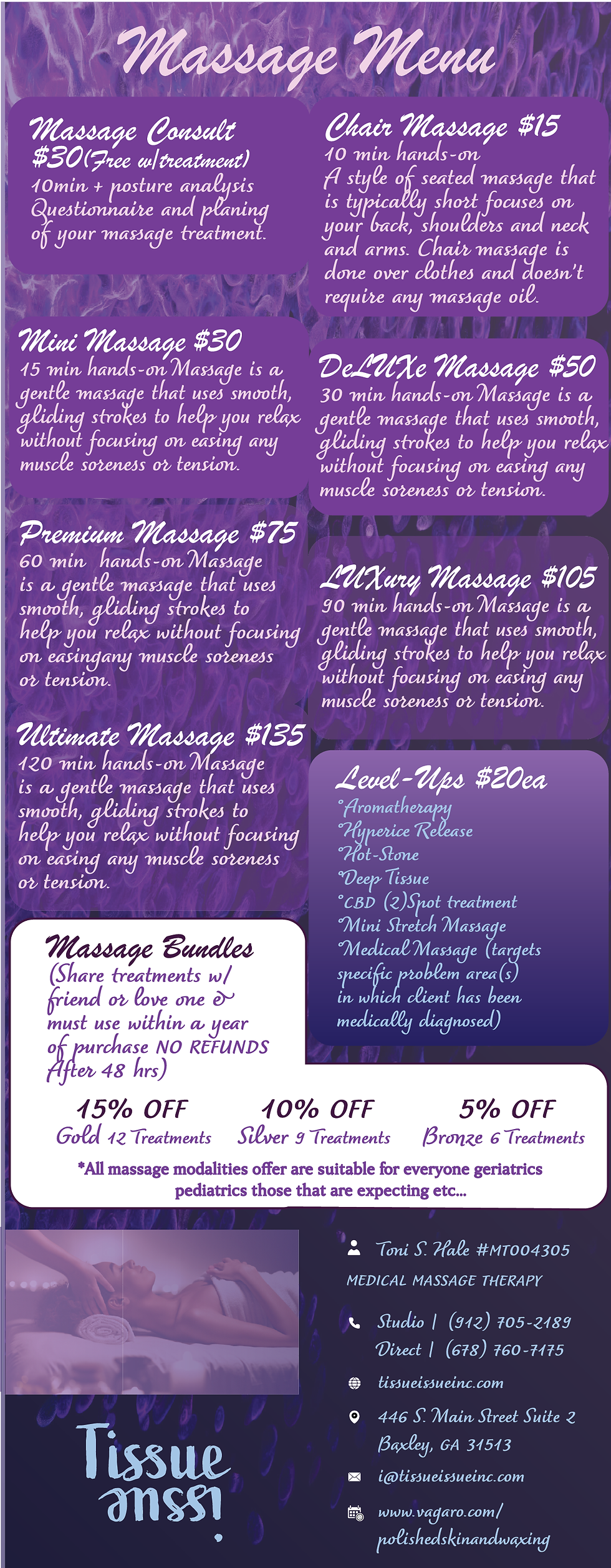
Menu Design
The menu takes after the Save the Date draft, with a textured background and the usage of blue and purple along with a cursive font to retain that luxurious feeling she was originally going for.


Business Card Design
Mrs. Hale-Tinner a needed new temporary business card for her current place of employment (Soothing Sensations) and passed the assignment along to me. I made two drafts. One preserved the elements from the original to make a marble remix, the other was a simple design, just in case she desired a change in aesthetics completely. Ultimately, she chose the familiarity of the marble one.


Instagram Post Designs
The first post is a simple redesign of a funny post that my client wanted to match her feed. The second post is a fun play on the words of a gospel song that my client came up with and needed me to execute. The first version delivered the idea of a massage, but my client pointed out that the hands needed to knead the person, so it was changed into hands that are rolled into fists instead of flat. The third post is a online/instagram reminder of her Birthday Business Shower.


Instagram Content Design
After rebranding her business, my client decided to revamp her feed by reintroducing herself to her followers. Keeping up with her branding, I used the same colors and fonts from her logo and save the date flyers.


Instagram Content Design 2
To help her customers become comfortable with her practice, I took content from my client's website and turned them into instagram posts to boost her engagement while being informative.Keeping up with her branding, I used the same colors and fonts from her logo and save the date flyers.


Bottle Label Design
Working with the information provided to me by my client, I created a bottle design for her first massage oil that she plans to sell at her business shower, and later on in her massage parlor. Major changes in concept happened around the 5th and 6th drafts, where I play around with the colors and font more. With such a small label, legibility & readability of the text became a concern so I tried out a different font & typeface.


Email Signature Design
When creating an email signature for my client, I made two based off of the pre-existing theme we came up with. The final design ended up being a mix between the two, with the dark purple theme and the text of the light purple design.


B-Day/Biz Shower Invitation
Here's the design of the actual invitation for the business shower. I'd started on an invitation that matched the purple glitzy theme that we'd had with previous work I'd done for her, when she said she wanted an invitation that was reminiscent of a library slip due to the "Bookworm" theme. I tried one in her theme colors purple and light blue, and one that looks like a typical library slip. The typical one was the favorite between the both of us so it was chosen!


Card Designs
I designed two unique cards for my client to distribute to her customers.


Thank You Sticker Design
I designed three potential stickers to be used for my client, who picked the dark purple design in the end because it appeals to men as well as women.


Designing Formal Documents
Here are some documents I either designed or redesigned for my client. All redesigns were done to maintain her theme and give her memorable branding.


